In the dynamic landscape of the digital age, where users access websites across a plethora of devices, the significance of responsive design cannot be overstated. As we navigate the vast array of smartphones, tablets, laptops, and desktops, the need for a seamless and consistent user experience has given rise to the power of responsive design. This comprehensive exploration delves into the intricacies of responsive design, its evolution, and the transformative impact it has on creating websites that adapt to the diverse needs of users across every device.
The Evolution of Responsive Design
Responsive design is not just a contemporary buzzword; it represents a paradigm shift in how we approach web development. In the early days, fixed-width layouts were the norm, providing a static experience that often fell short on smaller screens. The evolution towards fluid grids and flexible images marked a turning point, allowing websites to adapt gracefully to different screen sizes and resolutions.
The advent of smartphones accelerated the need for responsive design. The surge in mobile users prompted designers and developers to rethink their approach, giving rise to a mobile-first philosophy. Responsive design became synonymous with adaptability, ensuring that websites not only functioned but excelled on devices of all shapes and sizes.
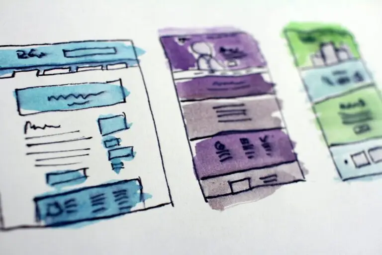
Core Principles of Responsive Design
At the heart of responsive design lies the concept of flexible grids. Instead of fixed pixel-based layouts, designers use relative units like percentages to create grids that adapt proportionally to the screen size. This ensures that the layout remains consistent and visually appealing across a spectrum of devices.
Responsive design goes beyond grids; it extends to images. Fluid images, defined using relative units or percentages, scale seamlessly with the layout. This prevents images from breaking the design on smaller screens while maintaining high-quality visuals on larger displays.
Media queries are the secret sauce of responsive design. These CSS rules enable designers to apply styles based on specific conditions such as screen width, height, or device orientation. With media queries, a single codebase can cater to a variety of devices, creating a unified user experience.
The Impact on User Experience
One of the primary advantages of responsive design is the ability to provide a consistent user experience. Whether a user accesses a website on a desktop during the day, a tablet in the evening, or a smartphone on the go, the layout, content, and functionality remain cohesive.
Responsive design inherently enhances accessibility. By adapting to different devices, websites become more inclusive, accommodating users with varying abilities and preferences. This is a crucial aspect of designing for a diverse and global audience.
Challenges and Best Practices
While responsive design offers a solution to multi-device compatibility, optimizing performance is a perpetual challenge. Balancing image quality, loading times, and code efficiency requires a meticulous approach to ensure a seamless experience across a spectrum of devices and network conditions.
Another challenge is prioritizing content for different screen sizes. Designers must make informed decisions on what content takes precedence on smaller screens without compromising the overall user experience.
Responsive design is an ongoing process. Continuous testing across devices, browsers, and screen sizes is essential to identify and address any issues that may arise. Regular iteration ensures that a website remains adaptive to the evolving landscape of devices and technologies.
Future Trends in Responsive Design
The future of responsive design involves pushing the boundaries of interactivity. From innovative navigation solutions to interactive storytelling, designers are exploring ways to create engaging experiences that transcend the limitations of screen size.
The integration of artificial intelligence (AI) and machine learning (ML) is poised to revolutionize responsive design. Adaptive interfaces that learn and evolve based on user behavior will play a pivotal role in creating personalized and intuitive experiences.
As AR technologies become more prevalent, responsive design will extend beyond traditional screens to encompass augmented reality experiences. Designers will need to adapt to three-dimensional spaces, creating seamless transitions between virtual and physical environments.
The power of responsive design lies in its ability to transcend the limitations of device diversity, providing a consistent and enjoyable user experience across the digital spectrum. From its humble beginnings as a solution to the rise of mobile users, responsive design has evolved into a fundamental principle of web development.
As we look towards the future, the integration of emerging technologies and a commitment to user-centric design will continue to propel responsive design into new realms of innovation and adaptability. It’s not just about creating websites for every device; it’s about crafting experiences that seamlessly integrate with the way users live, work, and interact in the digital age. Welcome to the era where responsive design reigns supreme, ensuring that the web remains a versatile and accessible space for all.