Color gradients have made a dynamic comeback in modern design, evolving from their once-basic application to a sophisticated tool that adds depth and dimension to visuals. Gradients, when used strategically, can elevate a design, making it more engaging, vibrant, and visually appealing. As digital landscapes continue to grow more competitive, mastering the use of gradients can help brands and designers create standout visuals that captivate audiences.
The Appeal of Gradients in Modern Design
Gradients are a versatile design element that blends two or more colors to create a gradual transition. This transition can mimic natural lighting and shading, making flat visuals appear more three-dimensional. The resurgence of gradients in recent years reflects a broader trend towards dynamic and expressive design styles.
Unlike flat colors, gradients introduce movement and energy into designs. Whether it’s a subtle shift between soft tones or a bold transition between vibrant hues, gradients help guide the viewer’s eye, create emphasis, and evoke emotions. Designers are increasingly leveraging gradients to add personality and uniqueness to their projects, from web interfaces to logos and promotional materials.
Creating Depth with Gradients
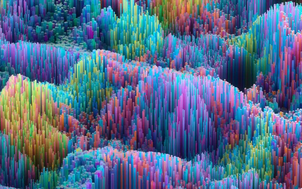
One of the most powerful uses of gradients is their ability to simulate depth. By mimicking how light interacts with surfaces, gradients can make elements appear closer or farther away, creating a sense of perspective. This technique is particularly effective in UI design, where gradients can enhance buttons, icons, and backgrounds to make them more tactile and interactive.
For instance, a radial gradient that transitions from a darker color at the edges to a lighter color at the center can create the illusion of a glowing or spotlight effect. Similarly, linear gradients can suggest a light source, adding subtle shadows or highlights that bring flat elements to life.
When used on larger surfaces, such as website backgrounds or hero images, gradients can create a layered effect. By combining multiple gradients or overlaying them with textures, designers can achieve a sense of depth that feels immersive without overwhelming the viewer.
Choosing the Right Colors
The success of a gradient lies in the choice of colors and how they transition. Complementary colors can create a harmonious blend, while contrasting colors can produce a more dramatic and striking effect. Designers should consider the psychological impact of colors when crafting gradients, as different hues can convey different emotions and messages.
For example, warm tones like orange and red can create a sense of energy and passion, while cooler tones like blue and green evoke calmness and trust. Experimenting with opacity and blending modes can further enhance gradients, allowing designers to create unique visual effects tailored to their specific design goals.
Gradients Across Different Mediums
Gradients are incredibly adaptable and can be applied across various design mediums. In web design, they are often used in buttons, navigation bars, and backgrounds to create a visually cohesive experience. In branding, gradients can add depth and complexity to logos, making them more versatile for both digital and print applications.
In digital marketing, gradients are particularly effective in catching attention. Social media graphics, advertisements, and promotional materials benefit from the vibrancy and movement gradients offer. By incorporating gradients, marketers can create visuals that stand out in crowded feeds and leave a lasting impression.
Avoiding Overuse
While gradients are undeniably powerful, overusing them can lead to cluttered or dated designs. The key is balance—using gradients as an accent rather than overwhelming the entire design. Subtle gradients often work best, especially when combined with other modern design trends like minimalism or bold typography.
Designers should also test their gradient-heavy designs across different devices and screen resolutions. What looks stunning on a high-definition monitor may appear less effective on older screens, so optimizing for various contexts is essential.
The Future of Gradients
As design tools become more advanced, the potential for gradients continues to expand. Innovations in color blending, 3D rendering, and animation are opening new possibilities for using gradients in creative and unexpected ways. Animated gradients, for example, are becoming increasingly popular for creating dynamic and interactive web experiences.
As the design world leans further into immersive and expressive visuals, gradients will remain a staple for adding depth and personality to projects. By embracing this versatile tool, designers can stay ahead of trends and create work that resonates deeply with their audience.
Color gradients are more than just a passing trend—they are a timeless tool that adds depth, emotion, and energy to visual designs. When used thoughtfully, gradients can transform flat designs into multidimensional masterpieces that stand out in today’s digital-first world. Whether you’re designing a website, crafting a brand identity, or creating social media content, gradients offer endless possibilities to elevate your visuals and engage your audience.